Most CFOs check the business more frequently than once a month. But the data available between formal reporting cycles is often fragmented: a cash balance from the bank portal, a revenue number from Salesforce that may or may not be current, a headcount count that someone ran last week.
The CFO is making decisions between reporting cycles on the basis of informal data that has not been reconciled, validated, or contextualized. When a customer requests extended payment terms, when a budget holder asks to bring forward a hire, when the board chair asks how the quarter is tracking, the CFO answers from memory and approximation rather than from a current, reliable view.
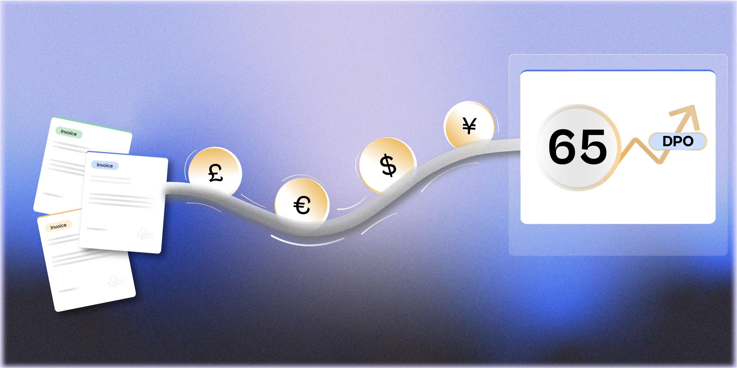
An AI-connected weekly dashboard changes that. Not a complex BI tool requiring months of implementation, a live view of the 10 to 15 metrics the CFO actually uses to monitor the business, updated automatically, with AI generated context on any metric that has moved significantly.
The 15 Metrics That Belong on a CFO Weekly Dashboard
Financial performance
- Revenue: week to date and month to date versus plan run rate
- Gross margin: week-to-date versus prior period and budget
- EBITDA implied full month: based on current month to date trajectory
- Operating cash balance: current balance versus minimum threshold
Working capital
- AR aging: total outstanding with over 30 day balance highlighted
- AP queue: total approved invoices pending payment with this week's expected disbursements
- Collections this week: actual versus expected based on AI payment probability model
- Cash conversion cycle: current versus prior period
Pipeline and commercial
- New bookings week to date: versus weekly run rate needed to hit monthly plan
- Pipeline coverage: total qualified pipeline versus required to close the quarter at plan
- Renewal exposure: contracts due for renewal in the next 30 days with renewal probability
Operational
- Open headcount: approved open roles versus hiring plan
- CapEx spend to date: versus approved budget for the period
- Top 5 open AP exceptions: invoices stalled in approval with days outstanding
- Critical supplier payment status: on time payment rate for strategic suppliers
How AI Populates the Dashboard
Data connections
Each metric needs a connected data source. AI reads these sources and populates the dashboard without manual export or entry:
- Revenue and margin: ERP or billing system, updated daily as transactions post
- Cash: bank feed or treasury management system, updated daily
- AR and AP: ERP AP and AR modules, updated as invoices are processed
- Pipeline: CRM, updated as deal stages change
- Headcount: HRIS, updated as hires are confirmed and departures processed
AI-generated metric commentary
For any metric that has moved significantly versus the prior week or versus plan threshold, AI generates a one to two sentence explanation using available context data: which customers drove the AR movement, which invoice category drove the AP queue change, which deals drove the pipeline shift.
The CFO does not need to investigate why a metric moved unless it requires action. The dashboard surfaces the movement and the AI generated context simultaneously. The CFO decides whether to act or to monitor.
RAG status and alert thresholds
Each metric has a defined RAG status threshold: Green means within tolerance, Amber means approaching a threshold that requires attention, Red means a threshold has been breached and action is needed. The thresholds are set by the CFO and reviewed quarterly.
The dashboard defaults to a summary view where only Amber and Red metrics are shown in detail. Green metrics are visible but do not require the CFO's attention unless they want to review them.
How the CFO Uses the Dashboard
The weekly dashboard is a five-minute review, not a deep analysis session. The CFO workflow:
- Review Amber and Red metrics: read the AI generated context for each
- Decide for each: no action needed, monitor next week, or take action now
- For action items: assign to the relevant team member with a specific question or request
- Note any metrics where the AI context is insufficient and ask FP&A for a deeper explanation
The dashboard does not replace the monthly management pack. It supplements it with a current view between cycles. The CFO who reviews the weekly dashboard arrives at the monthly management accounts review already informed about the period's direction, the monthly pack confirms and adds depth to what the dashboard has been showing.
What Makes a CFO Dashboard Fail
- Too many metrics. A 40 metric dashboard requires 40 minutes to review. Keep it to 15 or fewer. If a metric does not change the CFO's decision making when it moves, it does not belong on the dashboard.
- Stale data presented as current. A dashboard that shows yesterday's cash balance as 'current' when the CFO knows it is not reliable is worse than no dashboard. Every metric should show its data source timestamp.
- No threshold definition. Without defined RAG thresholds, every metric requires the CFO to independently assess whether the number is concerning. The thresholds do that work so the CFO focuses on Amber and Red.
- AI commentary that is too generic. 'AR has increased versus prior week' is not commentary. 'AR aging over 30 days increased $180K driven by three customers [A], [B], [C] accounting for 80% of the movement' is commentary. Generic outputs are not worth reading.
- No ownership of the dashboard. Someone needs to own the dashboard: maintain the data connections, update the thresholds, investigate when a data source is wrong. Without an owner, dashboard quality degrades over weeks.
The One Screen Principle
A well-designed CFO weekly dashboard fits on one screen without scrolling. If the CFO needs to scroll or navigate to get the full picture, the dashboard has too many metrics or too much detail at the summary level.
The one screen principle is also a design discipline. It forces a decision about which 15 metrics are genuinely the ones the CFO uses to monitor the business, not the 40 metrics that could be tracked, but the 15 that actually drive decisions between reporting cycles.
Start Here
Start by asking the CFO to identify the five questions they ask most frequently between reporting cycles. Those questions define the five most important metrics for the dashboard, the ones where not having a current, reliable answer costs time or creates decision-making risk.
Build the data connection for those five metrics first. Confirm the data is reliable, the update frequency is adequate, and the AI context is specific enough to be useful. Add the remaining 10 metrics over the following four to six weeks once the foundation is working consistently.